Ancestry Composition:
23andMe's State-of-the-Art Geographic Ancestry Analysis
23andMe's Ancestry Composition report is a powerful and well-tested system for analyzing ancestry based on DNA, and we believe it sets a standard for rigor in the genetic ancestry industry. We wrote this document to explain how our analysis works and to present some quality-control test results. This document goes into specifics for the current version of Ancestry Composition, offered to customers on the V5 platform. For customers on previous platforms, click here.
Your Ancestry Composition report shows the percentage of your DNA that comes from each of 78 populations. We calculate your Ancestry Composition by comparing your genome to those of more than 21,000 people with known ancestry. When a segment of your DNA closely matches the DNA from one of the 78 populations, we assign that ancestry to the corresponding segment of your DNA. We calculate the ancestry for individual segments of your genome separately, then add them together to compute your overall ancestry composition.
If you have questions, please contact Customer Care. You might also like to read our white paper (Durand et al., 2021) about the Ancestry Composition algorithm.
The Basics
DNA variants occur at different frequencies in different places across the world, and every marker has its own pattern of geographical distribution. The 23andMe Ancestry Composition algorithm combines information about these patterns with the unique set of DNA variants in your genome to estimate your genetic ancestry.
Here's an example of a haplogroup, a special kind of DNA marker, that illustrates the idea. This map shows the frequency of the maternal haplogroup H around the world. Haplogroup H is very common in Europe, is also found in Africa and Asia, and is rarely seen in people native to Australia or the Americas.
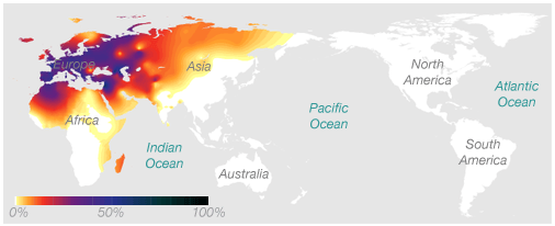
The association between this marker and geographic location works in two ways. If you know you have European ancestry, we know that there's a decent chance you have the H haplogroup. And if you have the H haplogroup, we know that your genetic history likely includes at least one European ancestor.
Although we can't locate your ancestry with much precision based on this one DNA marker, we measure hundreds of thousands of DNA markers on the 23andMe platform. If we combine the evidence from many markers, each of which offers a little bit of information about your ancestry, we can develop a clear overall picture.
Wrinkle #1: People Usually Have Multiple Ancestries
If all of your DNA came from one place in the world, figuring out where you're from would be easy. Recent research has suggested that, for a European person whose entire family comes from the same place, genetic analysis can locate their ancestral home within a range of around 100 miles!
But most people's ancestors come from many places. The technical word for this is admixture—the genetic mixing of previously separate populations. For example, it's common for people of European descent to have ancestry from all around Europe, and Latino people typically have ancestors from the Americas, Europe, and sometimes Africa.
Our Ancestry Composition algorithm handles the challenge of admixture by breaking your chromosomes into short adjacent windows, like boxcars in a train. These windows are small enough that it is generally safe to assume that you inherited all your DNA in any given window from a single ancestor many generations back.
Wrinkle #2: We Don't Know Which DNA Comes From Which Parent
Recall that for each of your 23 chromosome pairs, one chromosome in each pair comes from your mother and the other from your father. But genotyping chips don't capture information about which genetic variants reside on the same chromosome.
Here's a quick example to illustrate this point. Say, for a short stretch of Chromosome 1, you inherited the following genetic variants at three consecutive DNA markers:
from Dad: A-T-C
from Mom: G-T-A
When we look at your raw 23andMe data in this spot on Chromosome 1, we'll see the following:
You: A/G - T/T - A/C
The sources from which you inherited different variants are jumbled up. There are two possible "haplotypes" that are consistent with the raw data, and we don't know which one is your actual DNA sequence. It could be:
A-T-A
G-T-C
which happens to be wrong, or it could be:
A-T-C
G-T-A
which is right. The technical term for determining which variants reside on the same chromosome together is phasing. DNA data like our raw data is called unphased.
So what? This matters because we can learn more from long runs of many DNA markers together than we can learn from individual DNA markers alone. In the above example, the combination A-T-C will generally say more about your ancestry than the A, T, and C say when they are considered separately. Luckily, we can use statistical methods to estimate the phasing of your chromosomes. After phasing your raw data, the Ancestry Composition algorithm calculates ancestry separately for each phased chromosome.
The Setup: Defining Ancestry Populations
Prep 1: The Datasets
The Ancestry Composition algorithm calculates your ancestry by comparing your genome to the genomes of people whose ancestries we already know. To make this work, we need a lot of reference data! Our reference datasets include genotypes from 21,717 people who were chosen generally to reflect populations that existed before transcontinental travel and migration were common (at least 500 years ago). However, because different parts of the world have their own unique demographic histories, some Ancestry Composition results may reflect ancestry from a much broader time window than the past 500 years.
Consented 23andMe research participants comprise the lion's share of the reference datasets used by Ancestry Composition. When a 23andMe research participant tells us they have four grandparents all born in the same country—and the population of that country didn't experience massive migration in the last few hundred years, as happened throughout the Americas and in Australia, for example—that person becomes a candidate for inclusion in the reference data. We filter out all but one of any set of closely related people, since including closely related relatives can distort the results. And we remove outliers: people whose genetic ancestry doesn't seem to match up with their survey answers. To ensure a representative dataset, we filter aggressively.
We also draw from public reference datasets, including the Human Genome Diversity Project and the 1000 Genomes Project. Finally, we incorporate data from 23andMe-sponsored projects, which are typically collaborations with academic researchers. We perform the same filtering on public and collaboration reference data that we do on 23andMe participant data.
Prep 2: Population Selection
We defined the 78 Ancestry Composition populations based on genetically similar groups of people with known ancestry. To do so, we analyzed the reference datasets, chose candidate populations that appeared to cluster together, and then evaluated whether we can distinguish those groups in practice. Using this method, we refined the candidate reference populations until we arrived at a set that works well.
Here is an example of one of the diagnostic plots we use to define populations:
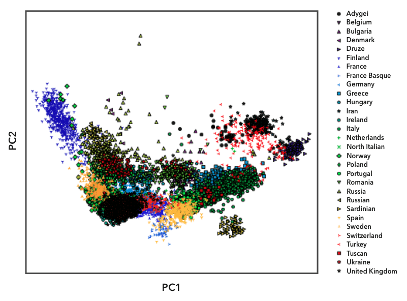
Here we have plotted the genomes in the European reference datasets using principal component analysis, illustrating overall genetic distance between any pair of genomes. Each point on the plot represents one person, and we labeled the points with different symbols and colors based on their known ancestry. You can see that people from the same population (labeled with the same symbol) tend to cluster together. Some populations, like the Finns (the blue triangles on the left), are relatively isolated from the other populations. Because Finns are so genetically distinct, they have their own reference population in Ancestry Composition. Most country-level populations, however, overlap to some degree. In these cases, we experiment with different groupings of country-level populations to find combinations that we can distinguish with high confidence.
The above plot shows the first two “principal components" (PCs), corresponding to the two axes of greatest variation within the data, but there is plenty of informative population structure in subsequent PCs. We compute and review a large number of PCs and use a mathematical technique called UMAP (McInnes L et al., 2018) to visualize information from multiple PCs in a single two-dimensional plot. Doing so at various geographic scales gives us tremendous insight into which populations the Ancestry Composition algorithm may be able to distinguish with high accuracy. Here is an example PCA-UMAP plot for a random subsample of our Nordic reference data:
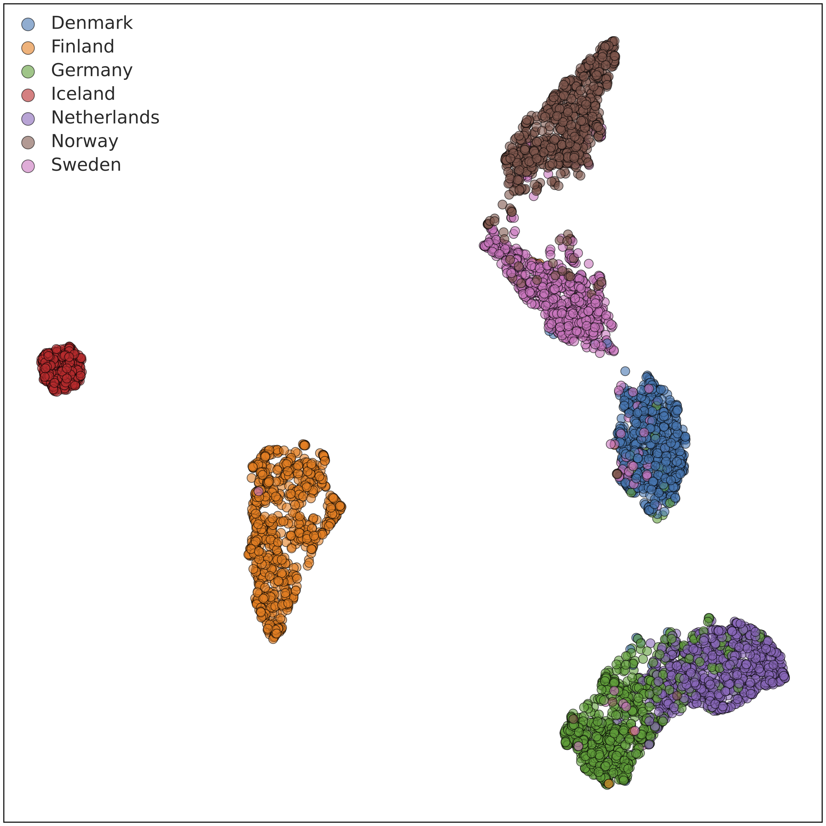
In this plot, we can see that individuals with four grandparents from Iceland (red) are very tightly clustered, as is often the case for island populations. Similarly, individuals reported four grandparents born in Finland (orange) cluster almost entirely together, but a handful cluster more closely with Norwegians and Swedes. Individuals with four grandparents from Norway (brown), Sweden (pink), and Denmark (blue) exist on a gradient that is fairly separable, with some cleanup. Consequently, we were able to include all five populations in the Ancestry Composition 7 update. The plot also includes individuals with German and Dutch ancestry.
Some genetic ancestries are inherently difficult to distinguish because the people in those regions mixed throughout history or have shared history. As we obtain more data, populations will become easier to distinguish, and we will be able to report on more populations in the Ancestry Composition feature.
Confronting Bias
Historically, biomedical research has disproportionately focused on participants of European descent. In light of this inequity, the 23andMe Research team is perpetually working to acquire new data from diverse populations. Our mission at 23andMe is to help all people access, understand, and benefit from the human genome. The best way we can do that for underserved populations is to include their genetic data in our research and in our ancestry features—maximizing the granularity of Ancestry Composition for all of our customers and helping to combat disparities in genetic science. We have worked proactively to reduce bias in genetics research by initiating projects like the Global Genetics Project, the African Genetics Project, the Population Collaborations Program, and our NIH-funded genetic health resource for African Americans. The genetic information we collect through these initiatives and others like them will help to improve features such as Ancestry Composition and will benefit the scientific community at large.
The Ancestry Composition Algorithm
Overview
The Ancestry Composition algorithm comprises four distinct steps.
First, we use a computational method to estimate the phasing of your chromosomes — that is, to determine the contribution to your genome by each of your parents. Second, we break up the chromosomes into short windows and compare your DNA sequence in each window to the corresponding DNA in our reference datasets, labeling your DNA with the ancestry whose reference DNA it is most similar. Third, we process those assignments to "smooth" them out, computing a probability distribution over ancestries for each segment of your genome. Fourth, we summarize these probabilities to “paint” your chromosomes with inferred ancestries. Each step in this process is described in more detail in the following sections.
Step 1: Phasing
Recall wrinkle #2 above. For each customer, we measure a set of genotypes (pairs of alleles). But what we really want is a pair of haplotypes for each chromosome. That is, we want to figure out the series of alleles present on each of your two copies of, for example, chromosome 7: one you received from your mother and one you received from your father. To do so, we built a very large "phasing reference panel" using data from more than ten million customers. We then use SHAPEIT (Hofmeister et al., 2023) to jointly phase these individuals. SHAPEIT uses sophisticated statistics and a very clever algorithm to do this. Once we have phased this large collection of customers, we can use the inferred information to efficiently phase new customers.
Step 2: Classifying Windows
After phasing your chromosomes, we segment them into consecutive windows containing ~300 genetic markers each. We measure between 7,300 and 45,000 markers per chromosome, which translates to 24 to 147 windows, depending on the chromosome's length. We consider each window in turn and compare your DNA to the reference datasets to determine which ancestry most closely corresponds to your DNA.
There are many ways to assign ancestry to DNA segments based on reference data, and we tried several. The best-performing option was a well-known classification tool called a support vector machine, or SVM. An SVM can "learn" different ancestry classifications based on a set of training examples and then assign new DNA segments to a learned category.
In the case of Ancestry Composition, we train the SVM with reference DNA sequences and tell it which ancestry population those sequences are from. Then, when we look at the DNA from a 23andMe customer with unknown ancestry (like you), we can ask the SVM to classify your DNA for us based on the reference datasets.
We use SVMs because they performed the best out of all the techniques we tried. SVMs are also very fast, which is critical for a large and growing database.
Step 3: Smoothing
The SVMs classify each window of your genome independently, creating a "first draft" version of your ancestry result. We use another computational process, called a smoother, to smooth this raw SVM output. The smoother uses a version of a well-known mathematical tool called a Hidden Markov Model to correct, or “smooth,” two kinds of errors. Hidden Markov Models are used to analyze sequential data, like biological sequences or recorded speech. As an example, suppose we had three ancestry populations: X, Y, and Z. An example of output from the SVMs might look like this:
Chromosome 1, Parent 1: X - X - X - Z - Z - Z - Y - Z
Chromosome 1, Parent 2: Z - Z - Z - X - X - X - X - X
The first kind of error the smoother corrects is an unusual assignment in the middle of a run of similar assignments. In the first line above, there's a run of Zs, interrupted by a single Y. It's possible that the lone Y was a close call between Y and Z that went the wrong way. If that were the case, the smoother could correct it to a run of just Zs.
The second kind of error the smoother corrects arises from the phasing step. Phasing algorithms can make mistakes, known as switch errors, where they mix up the DNA of one parent with that of another. The smoother can switch the ancestry assignments between your mother and your father if it detects one of these errors. In this example, there may be a switch error after the third window. If the switch were reversed, then the runs of Xs and the runs of Zs would stay together. In our simplified example, the smoother might output something like this:
Chromosome 1, Parent 1: Z - Z - Z - Z - Z - Z - Z - Z
Chromosome 1, Parent 2: X - X - X - X - X - X - X - X
This example illustrates the purpose of the smoother. But with real data the picture is much messier, and the correct inferences are rarely so clean. So instead of assigning a single ancestry to each window like we did in this example, the smoother estimates the probabilities of each Ancestry Composition population matching each window of DNA. The following picture shows a concrete example:
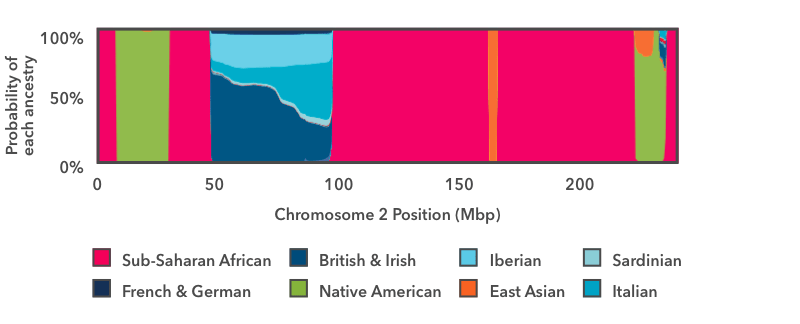
This is the output of the smoother analysis of one copy of chromosome 2. Starting on the left, there is a short run of pink, then a wider run of green, then another run of pink. In this chart, pink is the color for Sub-Saharan African ancestry, and green is the color for Native American ancestry. The y-axis runs from 0 to 100 percent, and it shows the probability that the DNA in that region of the chromosome comes from each Ancestry Composition population. These pink and green regions fill the entire vertical space of the graph, which means that we are 100 percent confident that the DNA in those regions has Sub-Saharan African and Native American genetic ancestry, respectively.
The next region to the right—between positions 50 and 100 on the x-axis—is a stretch of multi-colored blue. The thickest strip at the bottom is dark teal, which is the color for British & Irish. This segment of DNA has somewhere between a 50 percent chance and a 60 percent chance of reflecting British & Irish ancestry. The other shades of blue show that the same DNA segment also has a chance of reflecting Italian, Iberian, or French & German ancestry. If you think back to the haplogroup example above, this result makes sense: it is normal for a DNA marker to match reference DNA from lots of places, even if it matches some places better than others. In this example, the result shows that this DNA segment matches reference DNA from all over Europe. We can very confidently conclude that this stretch of DNA reflects European ancestry, but we are less confident in assigning it to one specific region of Europe.
Step 4: Painting
The last step is to summarize the smoother-computed probabilities to “paint” your chromosomes with an inferred ancestry for each segment of your genome. Once we’ve assigned an ancestry to each segment, we add up the lengths of all the assignments to compute your ancestry proportions. We use two different painting approaches, “most likely” and “threshold-based”, and display both in your Version History and DNA Painting Reports.
Mostly Likely Painting
In the “most likely” painting approach, we consider a genome segment’s ancestry probability distribution in the context of our population hierarchy. First, we add up probabilities across each continent and decide which continental assignment is most likely for the segment. Then, we add up probabilities across each region within the most likely continent and decide which region is the most likely assignment. Finally, we select the most likely sub-region within the most likely region and label the segment accordingly. Once we’ve painted all your chromosomes, we fill in any small anomalous segments with the ancestries of neighboring segments. This procedure gives the most specific population assignment to each segment of your genome—that is, there are no assignments to broader regional or continental populations.
Threshold-Based Painting
Another way to paint your chromosomes is to apply a threshold to the probability plot as in this figure:
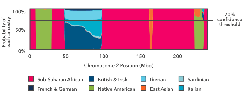
The horizontal line in this image indicates a 70 percent confidence threshold, which we will use for this example. You can view your own DNA Painting at different confidence thresholds, ranging from 50 percent (speculative) to 90 percent (conservative).
In this approach, we ask, for each segment, whether any ancestry has an estimated probability exceeding the specified threshold (in this case 70 percent). In this example, with the exception of the blue European stretch, the ancestry estimates exceed 70 percent over the majority of the chromosome. Consider the green vertical band near the right-hand side of the plot. Even though there is some probability that the segment comes from a different population, the Native American proportion exceeds the 70 percent threshold, and so we label this segment Native American.
In the case of the European segment, no single ancestry exceeds the 70 percent threshold, so we don't assign that DNA to any fine-grained ancestries. Instead, we refer to our hierarchy of ancestries. When this figure was originally generated, there was a "Broadly Northern European" ancestry that included four fine-level ancestries: British & Irish, Scandinavian, Finnish, and French & German. If, when we add up the contributions of each of these subgroups, the total contribution toward Broadly Northern European exceeds the 70 percent threshold, then we will report the region as Broadly Northern European.
In this example, the Broadly Northern European reference populations still don't exceed the 70 percent threshold, but the combined probabilities of all the European populations do. So this region is assigned "Broadly European" ancestry.
When using threshold-based painting, we use broad Ancestry Composition categories to avoid making assumptions about your ancestry when your DNA matches several different country-level populations. In regions where no ancestry—including the broad ancestries—exceeds the specified threshold, we report "Unassigned" ancestry. You can see the entire ancestry hierarchy in your Ancestry Composition report by clicking "See all tested populations."
Connecting With Close Family
Ancestry Composition is even more powerful if you have a biological parent who is also in the 23andMe database. Click here to learn more about connecting with family and friends.
Connecting with a biological parent greatly simplifies the computational problem of figuring out what DNA you got from which parent (see "Step 1: Phasing"). That may translate into better Ancestry Composition results.
Why is that? Remember, the smoother—the component of the model that generates your final Ancestry Composition estimate—has to correct two kinds of errors: those along the chromosome and those between the chromosomes. When your chromosomes are phased using genetic information from your parent, mistakes between the chromosomes (switch errors) are extremely rare, so the smoother can be more confident.
If you connect with one or both of your biological parents, you will get an extra result. You'll be able to see the Parental Inheritance view, which shows your mother's contribution to your ancestry on one side and your father's contribution to your ancestry on the other. We can't provide this view if you don't have a parent connected because we need at least one of your parents to orient the results. Here is an example of what you can learn from Inheritance View. Say your Ancestry Composition includes a small amount of Ashkenazi Jewish ancestry. When you look at your Inheritance View, you'll be able to see from which parent you inherited it.
Testing & Validation
Ancestry Composition includes a lot of steps, and each step has to be tested. We've discussed a few of those tests already while explaining our algorithm. In this section, we want to share some test results to give a sense of how well Ancestry Composition works. This section focuses on the final test we run, because that integrates the performance of each of the steps into an overall picture.
This test looks at two classic measures of model performance, precision and recall. These are the standard measurements that researchers use to test how well a prediction system works. Precision answers the question "When the system predicts that a piece of DNA comes from population A, how often is the DNA actually from population A?" Recall answers the question "Of the pieces of DNA that actually are from population A, how often does the system correctly predict that they are from population A?"
There is a tradeoff between precision and recall, so we have to strike a balance between them. A high-precision, low-recall system will be extremely picky about assigning, say, Korean ancestry. The system would only assign DNA as Korean when it is very confident. That will yield high precision—since the assignment of Korean is almost always correct—but low recall, because a lot of true Korean ancestry is left unassigned.
With a low-precision, high-recall system the opposite problem exists. In this case, the system liberally assigns Korean ancestry. Any time a piece of DNA might be Korean, it is assigned that ancestry. This will yield high recall, as most genuine Korean DNA will be labeled accordingly, but low precision, because non-Korean DNA will often be incorrectly labeled Korean.
The ideal system has both high precision and high recall, but that may be impossible in real life. Let's see how Ancestry Composition performs on these metrics. For this quality-control test, we set apart 20 percent of the reference database, approximately 4,300 individuals of known ancestry. We trained and ran the entire Ancestry Composition pipeline on the other 80 percent of the reference individuals. Then we treated the "hold-out" 20 percent as though they were new 23andMe customers and used our Ancestry Composition pipeline to calculate their ancestries. Since we know these people's true ancestries, we can check to see how accurate their Ancestry Composition results are. We repeated this test four more times, with a different 20 percent held out each time, and then averaged across the five tests to give the following results, shown here for a minimum confidence threshold of 50%:
| Population | Precision (%) | Recall (%) |
|---|---|---|
| Sub-Saharan African | 99 | 99 |
| West African | 98 | 100 |
| Senegambian & Guinean | 96 | 97 |
| Ghanaian, Liberian & Sierra Leonean | 97 | 91 |
| Nigerian | 93 | 99 |
| Northern East African | 97 | 95 |
| Sudanese | 96 | 88 |
| Ethiopian & Eritrean | 95 | 99 |
| Somali | 98 | 96 |
| Congolese & Southern East African | 99 | 99 |
| Angolan & Congolese | 99 | 99 |
| Southern East African | 98 | 97 |
| African Hunter-Gatherer | 99 | 98 |
| East Asian | 99 | 99 |
| Japanese | 99 | 99 |
| Korean | 98 | 99 |
| Chinese | 96 | 99 |
| Northern Chinese & Tibetan | 87 | 97 |
| Southern Chinese & Taiwanese | 88 | 78 |
| Southern Coastal Chinese | 91 | 94 |
| Chinese Dai | 95 | 97 |
| Vietnamese | 97 | 97 |
| Filipino & Austronesian | 96 | 88 |
| Indonesian, Thai, Khmer & Myanma | 93 | 66 |
| Northern Asian | 74 | 86 |
| Manchurian & Mongolian | 60 | 75 |
| Siberian | 87 | 90 |
| Indigenous American | 100 | 99 |
| Arctic North American | 99 | 99 |
| Western North American | 99 | 97 |
| North American | 98 | 98 |
| Southern Mesoamerican | 99 | 98 |
| Central Andean & Amazonian | 99 | 97 |
| Northern Andean | 98 | 97 |
| Melanesian | 98 | 95 |
| Central & South Asian | 98 | 97 |
| Central Asian | 91 | 49 |
| Northern Indian & Pakistani | 87 | 90 |
| Bengali & Northeast Indian | 94 | 95 |
| Gujarati Patidar | 99 | 96 |
| Southern Indian Subgroup | 97 | 88 |
| Southern Indian & Sri Lankan | 85 | 94 |
| Malayali Subgroup | 97 | 85 |
| Western Asian & North African | 97 | 95 |
| Northern West Asian | 88 | 91 |
| Cypriot | 96 | 92 |
| Anatolian | 93 | 58 |
| Iranian, Caucasian & Mesopotamian | 71 | 94 |
| Arab, Egyptian & Levantine | 96 | 87 |
| Peninsular Arab | 91 | 76 |
| Levantine | 97 | 72 |
| Egyptian | 85 | 92 |
| Coptic Egyptian | 94 | 95 |
| North African | 96 | 92 |
| European | 99 | 100 |
| British & Irish | 98 | 96 |
| Irish | 95 | 95 |
| Scottish | 96 | 90 |
| English | 88 | 86 |
| Welsh | 97 | 86 |
| Western European | 94 | 95 |
| Dutch & Northern German | 93 | 91 |
| Belgian, Rhinelander & Southern Dutch | 93 | 92 |
| French | 86 | 89 |
| Swiss, Southwestern German & Western Austrian | 97 | 93 |
| Austrian & Southern German | 92 | 86 |
| Nordic | 98 | 97 |
| Norwegian | 97 | 91 |
| Swedish | 92 | 89 |
| Danish | 95 | 93 |
| Finnish | 96 | 95 |
| Icelandic | 99 | 98 |
| Spanish & Portuguese | 94 | 95 |
| Portuguese & Galician | 90 | 91 |
| Aragonese & Catalan | 88 | 84 |
| Basque | 90 | 95 |
| Canary Islander | 84 | 56 |
| Andalusian, Asturian & Castilian | 89 | 84 |
| Italian & Maltese | 96 | 95 |
| Northern Italian | 94 | 92 |
| Southern Italian | 93 | 93 |
| Sardinian | 97 | 95 |
| Maltese | 99 | 95 |
| Greek & Balkan | 97 | 95 |
| Bosnian, Croatian, Montenegrin & Serbian | 96 | 92 |
| Kosovar & Northern Albanian | 94 | 93 |
| Albanian & Macedonian | 90 | 88 |
| Greek | 87 | 73 |
| Bulgarian, Moldovan & Romanian | 93 | 89 |
| Central & Eastern European | 95 | 96 |
| Estonian | 92 | 87 |
| Latvian | 94 | 92 |
| Lithuanian | 93 | 90 |
| Slovenian | 94 | 95 |
| Czech, Hungarian, Slovak & Southern Polish | 91 | 87 |
| Belarusian, Polish & Ukrainian | 86 | 91 |
| Russian | 90 | 68 |
| Ashkenazi Jewish | 99 | 98 |
This table shows that our precision numbers are high across the board, mostly above 90 percent, and rarely dipping below 75 percent. That means that when the system assigns an ancestry to a piece of DNA, that assignment is very likely to be accurate. You can also see that as you move up from the sub-regional level (e.g., Irish) to the regional level (e.g., British & Irish) to the continental level (e.g., European), the precision approaches 100 percent.
Poor recall doesn't mean bad results. Some populations, like Russian, are hard to tell apart from others. When Ancestry Composition fails to assign Russian DNA, that DNA is almost always classified as "Belarusian, Polish & Ukrainian", a closely related population.
The precision and recall metrics reported above are for unadmixed individuals. We conducted similar experiments for admixed individuals by simulating individuals with known ancestry. As this is a harder problem, performance isn't quite as good as for unadmixed individuals, but it is still quite good.
The Future of Ancestry Composition
Ancestry Composition has a modular design. This was intentional, because it allows us to improve individual components of the system—like the phasing reference panel, the SVM reference populations, or the smoothing procedure—without affecting the other steps in the analysis pipeline.
We hope to update Ancestry Composition regularly. When we improve some component of the system or upgrade the reference datasets, your results will automatically be updated. You will be able to see a list of those updates in the Change Log at the bottom of your Ancestry Composition report's Version History.
- Durand EY et al. A scalable pipeline for local ancestry inference using tens of thousands of reference haplotypes. bioRxiv 2021.01.19.427308 (2021)
- Hofmeister RJ et al. Accurate rare variant phasing of whole-genome and whole-exome sequencing data in the UK Biobank. Nat Genet 55, 1243–1249 (2023)
- McInnes, L et al. UMAP: Uniform Manifold Approximation and Projection for Dimension Reduction. ArXiv 1802.03426 (2018)
Updated September, 2025